Since the Box was part of a class called "Concept Development", I did have to do quite alot to actually create it. It wasn't all about sitting down and doing the whole this in one shot. We had weeks of different planning. Most of it, being things you would never think to do. but in the end, those exercizes actually reshaped the final product, and made it that much better.
These drawings are those ideas. not meant to be works of art, by any means. Rather, used to provide insight into how it all came together. Hope you find it to be interesting!
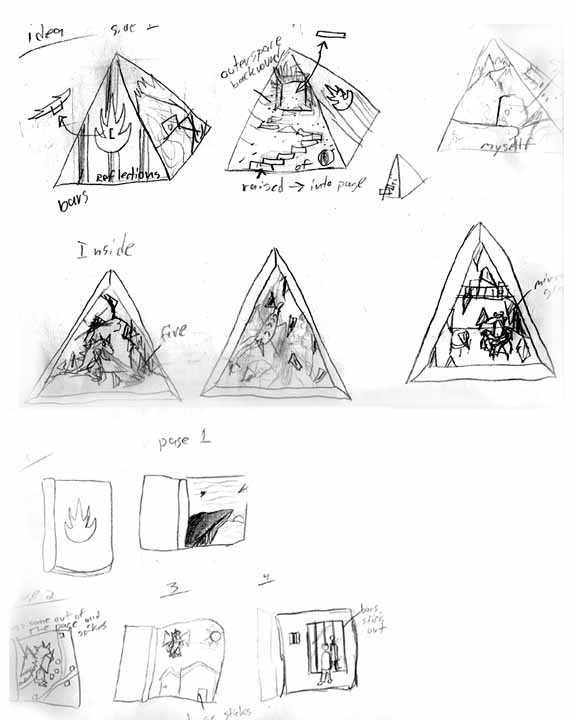
We had to come up with a few possible ideas for our project. So besides the box, which was chosen, here are two others. The book at the bottom continues on, but i really didn't think it was worth scanning. Only about 4 more panels.
Concept ideas for the inside of the Box. Obviously, you can see i went with the top one.. sort of. Like everything else, the final idea was changed a bit.
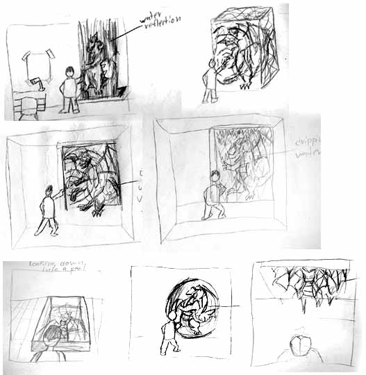
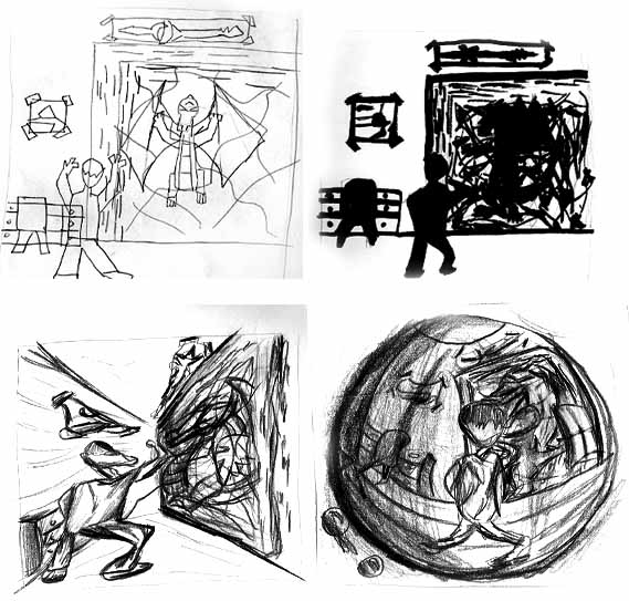
Here, the teacher made me think of different ways that the mirror could be. Not necessarily anything i would use, but just to get me think of how many different ways you could get a "reflection".
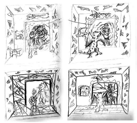
More of the same, but this time, keeping it with things i might actually consider using. And then again.. more just to try out different ideas.
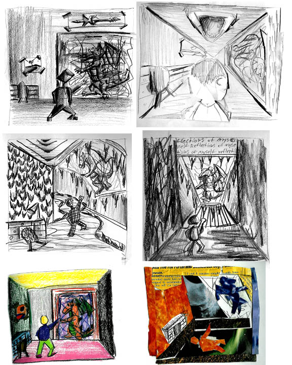
And more concepts! This time, we had to take our idea and:
top left- make it completely flat
top right- make it silhouetted. using only black and white.
bottom two- distort the hell out of it. I went for the Pinch and sphereize look, that you might get with photoshop. Much harder to draw though, than click the little button.
Yes, we had to play around with our main concept, a whole lot. So here we go again!
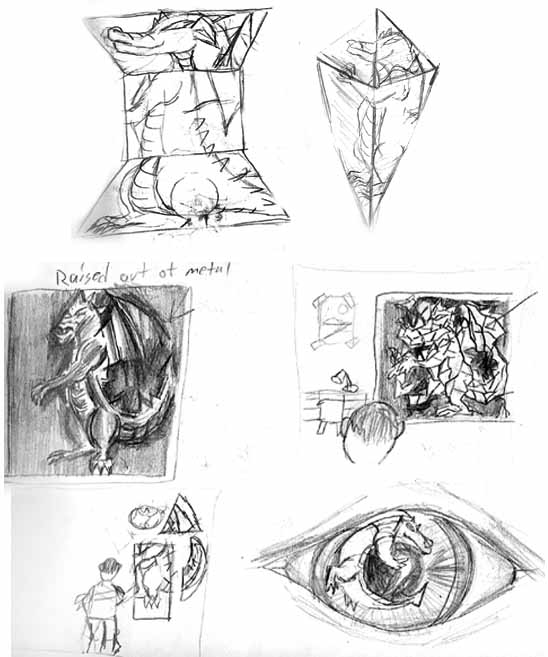
top left- the concept made entire with primative shapes
top right- concept made with cut papaer (it originally raised off the page)
middle two- crazy textures and totally obscure angles.
bottom left- colors that we would NEVER pick. You would think this is pointless, but it actually worked out interesting. Looking at it when you're done, and saying, "now why did i not want these?" Yes, they are horrible, but what MAKES them horrible? in my case, it was the fact that almost all of them clashed horrifically.
bottom right- Making the picture from cut out mazazines. It was just.. interesting.. and thats about all i can say about that..
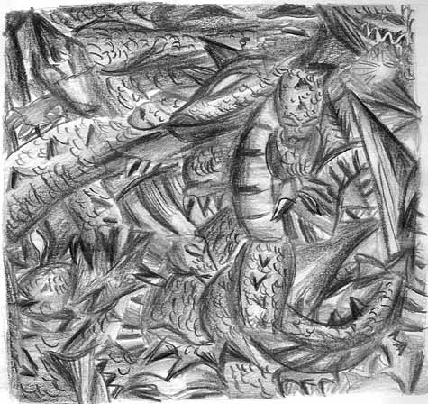
Fox Cubism! For those that don't know, Cubism is when you take a picture, and draw pieces of it from many different angles. Rotating and throwing them around in weird compositional ways. I don't really like this kind of abstract art, but i have to say that it was kind of fun, and turned out pretty well. Oh yes, it was also pretty hard also.. hard to do RIGHT.
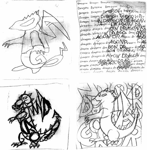
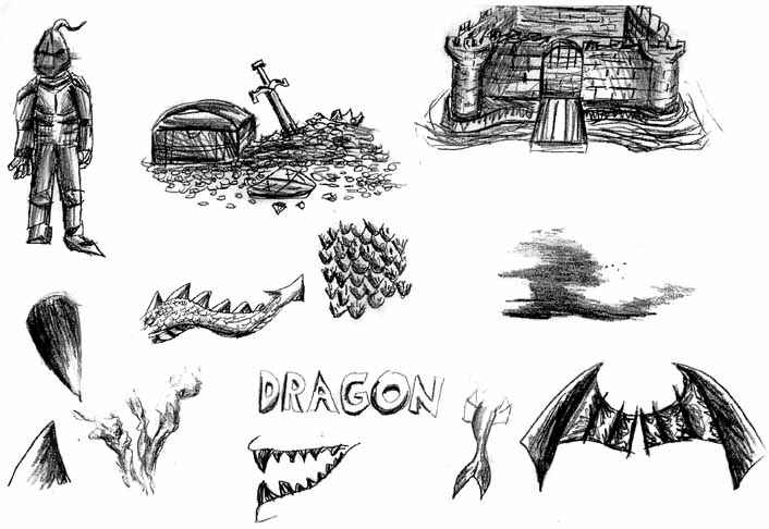
Now for this, we had to take an aspect of our consept, and draw it a bunch of different ways, using the name of the object. i chose "Dragon" So what you get, is me creating the dragon, from the word "Dragon". The bottom left one is still really cool to me. It's just interesting what you can make anything out of.
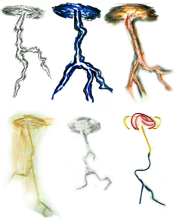
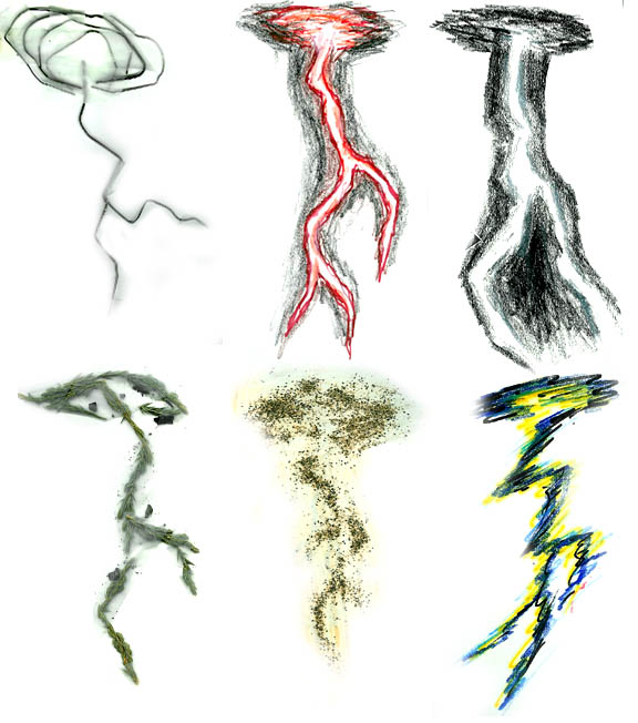
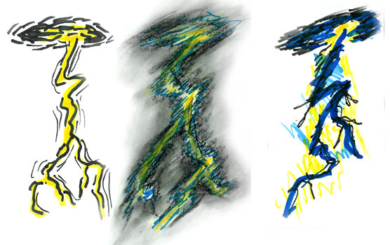
Another exercize of drawing things a million ways. in this class, we did that alot. So i had to draw my lightning bolt, a bunch of different ways. And to make this easy... They go from left to right.
1- penned lightning.
2- markers
3- pastel
4- spaghetti! Thats right, Spaghetti taped to a page.
5- tin foil!
6- rubberbands!!
7- Stretched out paperclips!
8- mixed media. Colored Pencil and Marker
9- mixed media. Marker and Pastel
10- heh, this is a good one.. It's some clumps of pine needled, taped together on the page. Hows THAT for creativity?
11- Sand. Which actually started to inspire me, because i liked how it boke apart as it got away from the center.
12- Now i start to really experiment. Using purposely dryed out markers to get a very raw, scratchy look. Trying to sort of replicate the look i got from the sand, but not completely.
13- Markers again. This reminds me of Pop Art.
14- ALL the media i had. Which is: Markers, Colored Pencil, Pens, and Pastel.
15- Crazy fast and wreckless marker drawing.
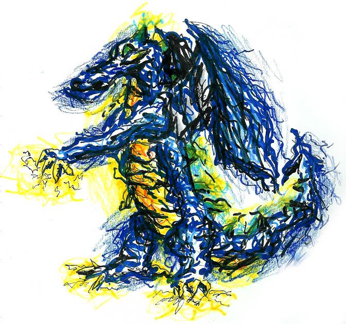
So now, after all that, You would wonder, did it help me any? the answer is definitely yes. I really liked the scratchy lightning look, so i decided to try that entire style, over a full color drawing of Fox. You would notice that this is what i used for my final too. This style. Would i have come up with it if it wasn't for this exercize? No way. Anfd at first glance, it looks sloppy as hell, but it's really cool as you start to really look at it. It;s completely full of energy. It would be what Fox could look like before he turns himself into electrical particles, and explodes away. But again, never would have come up with it if it wasn't for that assignment. I encourage everyone to try that. See how many different ways you can draw the same thing.. who knows what you could come up with.
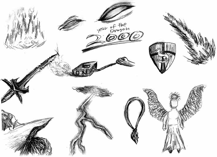
Ah, back to the boring stuff. But still interesting. For both of these I had to show my "dragon" without actually showing it. Some pictures are a bit more out there than others. like the angel? well that was supposed to be the OPPOSITE of dragon. i know devil is really the opposite, but what IS the opposite of dragon, anyway? Knight? oh, got that.
So a few of these are general things people would think of, when they think of "dragon". And others are more homed to my character. like the sword, and eye, and necklace. Etc.
And there you have it! i hope this helped provide a bit more insight into how the box was fully developed. maybe even inspired some of you to try those exercizes. I really reccomend them. it shows how creative you really can be.