Something I've always kinda wanted to do, and have had recent fortune to, is make clan graphics for Unreal Tournament.
Why? Because I think I can do a pretty good job and the work is seen by all who come across it. Plus, it's nice to give back to the UT community. So this page will be for the logos and graphics I end up doing for people.
Currently:
Page 1 one UT Community Event, HTM, psk, and SBD
Page 2: {DT}, and a Fan Pack Graphic contest
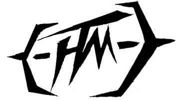
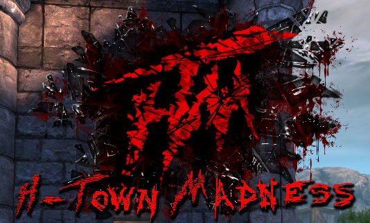
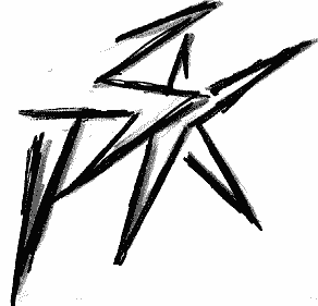
HTM: H-Town Madness
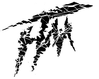
This is the concept sketch. Something I whipped together in my sketchbook in under an hour. Originally, their clan was {HTM} so I tried to incorporate the { } into the logo, in a way that made it look like crosshairs. But the leader (Minion) later told me that they got rid of the { } and ALSO wanted it to look more like "madness". So I scrapped those, but kept the original letter design.
And went to this, which is actually the exact same above drawing, just taken into Photoshop. All I did with this, was make a selection around a section of the logo, and shift it, or delete it. Thats it! I Just happened to do it 100+ times. It's a great tactic though, and when done well, can yield some great results.
Minion really liked the logo as a darker red, so I went with that, and this is an overlay that appears on the game screen when you go into specific servers they own. For this, I tried to make it look like a smashed hole in the screen, with bloody glass around it everywhere. The best part about this particular logo is that it uses an alpha channel to make the glass actually transparent. So anywhere you put it in the game, it all still shows through in front of you. It was pretty tricky to get it that way also. Lots of playing around back and forth with the alpha, but in the end, all good.
Minion liked the other logo so much, he hired me on to do some for the rest of their servers. We both agreed to make them all look different per server, and this is the first of those 4. They're all in this "globe" shape for a special insert into UT which makes them look like transparent balls.
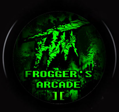
So, Frogger's Arcade, well Frogger is green.. right? and Arcade should look old style.. and lets throw some blood around.. but it's gotta be green! Thats basically all I had with this. I've been considering to redo it over, but I think it works anyway.
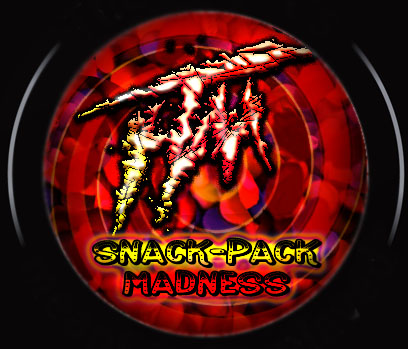
For "Snack Pack Madness" I actually went online and grabbed a few pictures of snacks, and threw them around all over in the background. Originally, it was all rainbow psychedelic, but when put into UT it got rather destroyed, so I went with more yellow and red tones. There is a simple gradient that I swirled, overlayed ontop of everything to give it that extra "madness" look, and I tried to give the "HTM" logo a sort of.. snack look. Like maybe you could actually eat it. But it also had to be bright enough to stand off over the crazy background.
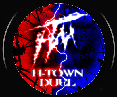
Duel was a fun one. In UT (and most games) it's Red vs Blue, so the theme of this is that red and blue are battling.. duh. I tried to fill this one with lots of energy, and for the most part I'm pretty happy with it. It's fun for me to take that HTM logo and make it into different things. Here, we have it make into lightning.
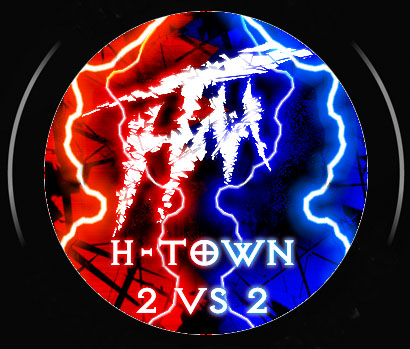
All a 2vs 2 is, is a duel with 2 people on each team instead of one. With that in mind, it was at first pretty hard for me to think of something for this. But in the end I went with the lightning bolts representing each player. So you have 2 red, and 2 blue. It's actually the lightning bolt from Duel, reversed and recolored different times, with a slightly altered background, and altered HTM glow. Making this wasn't very hard, but it was the concept that took the most time.
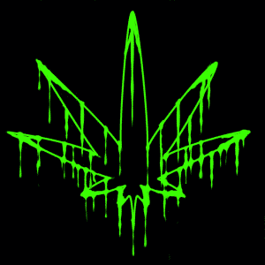
This is actually the clan I'm in. Which is funny because I don't smoke pot, or even drink.. and really, I just am pretty against drugs.
However!
The guys in psk for the most part, are some of the nicest and most fun people to play with, that I've ever seen. Thats why I joined them in the first place, and thats something that still rings true today.
So since I did some stuff for HTM, I figured I may as well go ahead and try my hand at some psk stuff.
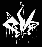
I did a bunch of concept art, but the final Logo was the bottom bloody leaf.
If you want to see all the work I did for psk (and it's alot), then check out the website.
Everything you see on there, is done by me.
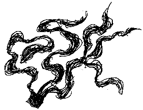
This is my attempt at making "psk" out of smoke. Which pretty much worked.. except for the bottom part of the K. That was hard.
I tried to kinda make it like the bullets made the smoke,because it's ".psk" and I thought it would be cool to make the " . " into a bullet hole.
attempt #2 of making psk into smoke! this time from a single source. Maybe like a blunt or something after I finalized it.
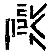
I really like this one, but it doesn't have ANYTHING to do with "pot" or "smoking" at all. Just looks cool.
And I absolutely love this one. At first glance, it doesn't look like anything, and what does it have to do with psk? pot? smoking? killing people? where is ANY of that?
Well see, the logo fucks with your head! Like pot does- though not the same way. It's a twisted eyetrick. The letters "psk" are in BETWEEN the lines. Not the lines themselves.
Oh.. was that too over your head? ah well....
Last but not least, I made this.. and actually made it at the last second. I saw the leaf, got a quick idea.. tried it.. works pretty good! Tweaked it a bit more and there you have it. I think it's the most "logo-looking" one out of the batch. And the rest agreed.
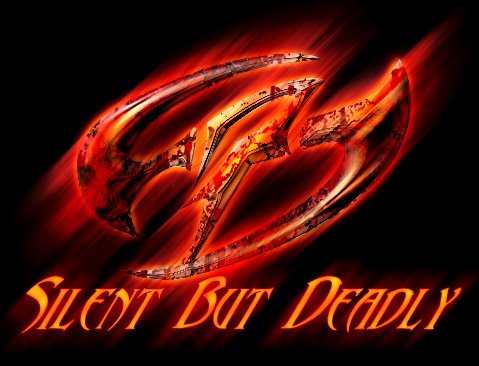
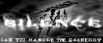
SBD: Silent But Deadly
SBD is a friend clan of HTM and (I hope =D) psk. They're a fun group of people, like HTM, and I got a good idea while I was over break to do a logo for em.. even if they sorta-kinda already had one, but not really.
I made this after my spurt of psk logo tweaking. Just got a random burst of creativity, and was extremely happy with the result!
Instead of taking on the obvious toilet humor I could have done, with Silent But Deadly", I wanted to go a different route. Like, if SBD was a weapon, silent, but deadly, what would that look like? Well I think it would look something like this! Kind of like a twisted throwing star.
This was just the flat design though.
HTM: H-Town Madness- merchandise
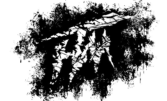
This is the most basic version of the HTM stuff I did. Straight black and white, with other effects added in. Tried to make it look sorta like someone blew a hole in the paper, so on a shirt, it would look kinda like someone blew a hole in you. I think I would need shirt tears and such though, to pull that off correctly.
I recently had the work I did for HTM, turned into merchandise objects. Like shirts, mugs, and so on. Originally, the founder of HTM started this up, using what I had given him before. The thing was though, I didn't make those things for shirts, and so on. So I knew I could do better with a specific goal in mind. Knowing they were going on shirts and so on, I made some brand new ones, and personally, I think they're the best of the bunch.
If you want to get any of these, or just check out the store, go here! All profits will go to Minion, for hosting great servers for the UT community, all out of his own pocket.
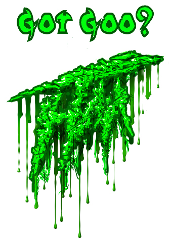
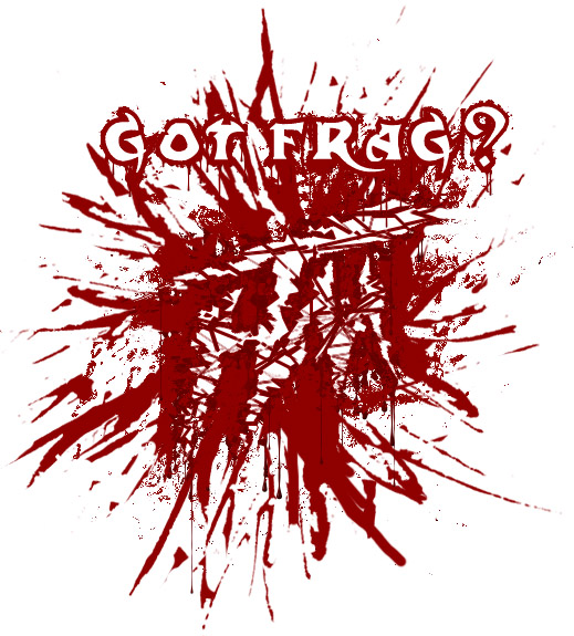
Minion had made a bunch of shirts that just said things like "Got Goo?", "Got Frag?" and so on. Well I saw potential with this, and decided to do different versions of the HTM logo, styled to fit with whatever the text was asking. It was a really fun project, as I always enjoy taking one thing and making it into as many different things as possible. It flexes the creativity muscle.
So here, if it's not obvious enough, is the HTM logo as goo!
A "frag" in game terms, is when you kill someone. So what I went with here is the blood splatter look.
What I really like about this is the negative space. Like if you just glanced at this, you might not see the HTM in there, since it fits within the splatter. It's always fun to use the background color to make actual images. In this case, the white HTM. And actually, the text too.
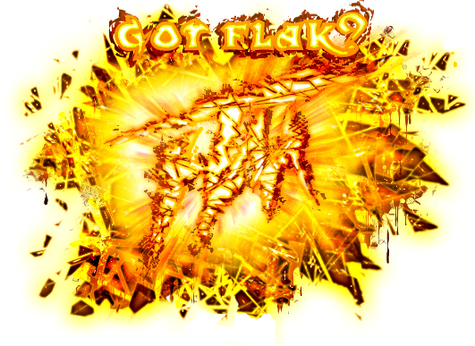
Ah, Flak. You would mostly understand this if you play UT. Flak is basically a ball, or glowing yellow shards, that shoot out and shred/burn the enemy. So for this I tried to make it look like someone was flakking you, or flakking the HTM, or however you want to look at it. Either way, lots of vibrant color, I was happy with this.
This is the end result. Fun with Photoshop more than anything else.
Originally, I had it planned to be more white looking, but I made the text and altered it to be yellow. That looked so badass, I decided to change around the logo too, to match the text better.
Consistency is important!
PSK concept art
SBD Clothing
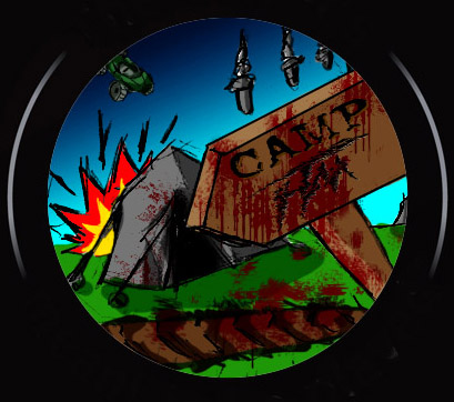
HTM ended up ditching a bunch of servers, like 2v2, snack pack, and etc. Rather than keeping it empty though, they just got new servers. One they made was "Camp HTM". Minion told me this was a "trails" server, and mostly had younger kids playing on it, So.. taking that, I made a cartoony stylized one. TOTALLY different than all the rest, but thats whats cool about it. It's a completely different feel, for the same people!
Cel Shading gone wild!
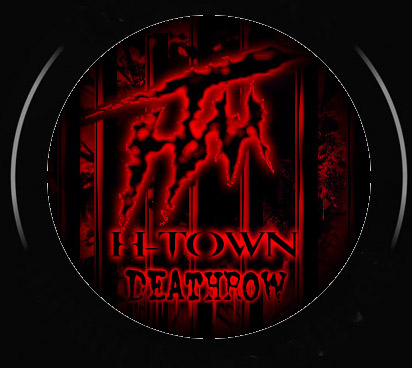
Another one they added was "deathrow". This, I just basically took the Duel server logo and switched it around, added bars, and etc. but it was really easy
This isn't a clan logo, but I made the signature graphic for someone in their clan. Incidentally.. he ditched it shortly after because I think he went to clan "I" or something. I'd be mad about that! Except it didn't take very long to make. ^_^
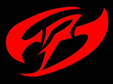
The folks over at SBD liked that logo so much, they had me make one for their main site, and even a clothing line also. Or at least, graphics FOR clothing.
You can see that all right here. And the main logo is on every page, so just look up, and you'll see it.
It was really cool to get such a happy response from almost everyone at SBD about this. I even had people in game going "DUDE! RED! (thats what I play as), that logo was so sweet man! you rock!" And while *I* might think it rocks, it still means even more to hear it from people- and multiple people is even better =D
I'm extremely happy they liked it so much, and will probably do more in the future!
Click the logo to check out the graphics I made for it.
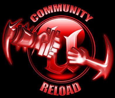
Community Reload is an awesome event from the minds of HTM|Minion and |HM|Unhinged that is being run by some of the finest people in the UT2k4 community. The purpose is to gather many good players and have them help out the lesser ones through a number of different classes and so forth. This extends all the way from basic UT techniques likes dodging and such, all the way to just being a better player with good sportsmanship.
After awhile, I decided to do the psk logo without "psk" on it anywhere. It gives a much bolder look.. especially because you're like, what? what is that for? Kinda scary too. =D