IMaGE is a band started my one of my friends who, oddly enough, is in the roleplaying guild that I run. But He is quite the professional, as are the rest of the members, so the odds are, that they will go far.
Either way,he commissioned me to do a bunch of concept ideas for him, and eventually picking a final one to do as fully crisp, for the logo that they would use. Did they choose the right one? You be the judge!
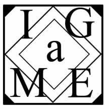
IMaGE Art
instantly, when Brian told me the name of the band was "image" I thought it would be cool to make that word, in a crazy symbol. Something that you would have to look at for awhile, before you could say that the Image itself, made up the word 'IMAGE" The "A" is supposed to b lowercase, but it made better sense to keep it capitalized, for composition.
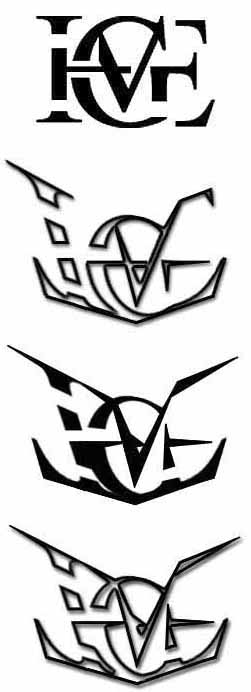
Anyway, the first idea was my concept. And I sent that around, to which people told me that it looked like a cool idea, but was too boring.
So then, I redesigned the logo, to be more stylized, but still thought i could do more with it.
So I refined it further.
This is my personal favorite. I just think it's a badass looking logo. My boss says it reminds him of the transformers logo "And everyone loves transformers!" he says. Heh, well I can see that, but I just think it looks really cool.
They didnt go with it though.. Not to say the others are bad. the one they picked is still really nice.
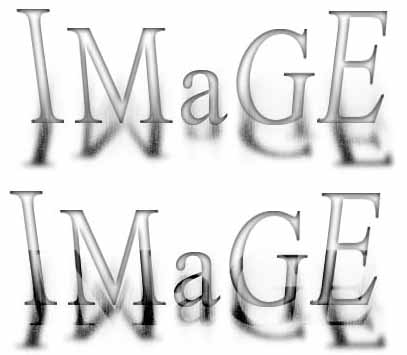
Not this one. This was just part of the concept batch I sent to them. Brian said he wanted something "Sturdy" So there ya have it.. A bit too simple, but it was just concept.
For this, I was thinking blurred film negative, or something like that. Like a blurred photograph that was fading. And i set out to just give them something completely different than the first two.
The bottom picture is just the top one, inverted. but I wanted to make sure they saw it could be altered and changed completely.
Don't bother clicking this one. That is as big as it goes. For such a simple desgin, I didn't think it needed to be resized because really, this is what you see, only bigger.
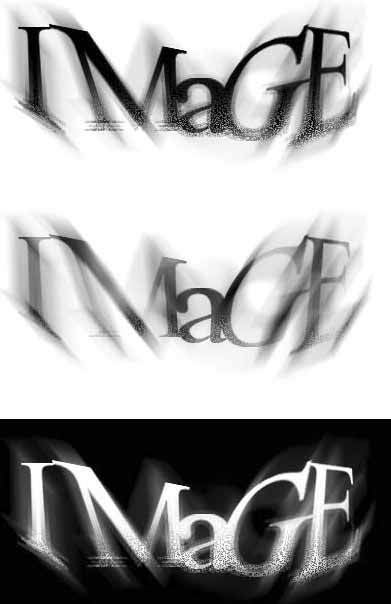
Anyway, this isn't what i would even consider for a band logo, but Brian also ask for "something simple" So there we have it.
Even in it's simplicity, it's still not that bad. And has all KINDS of crazy color potential.
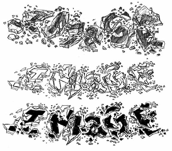
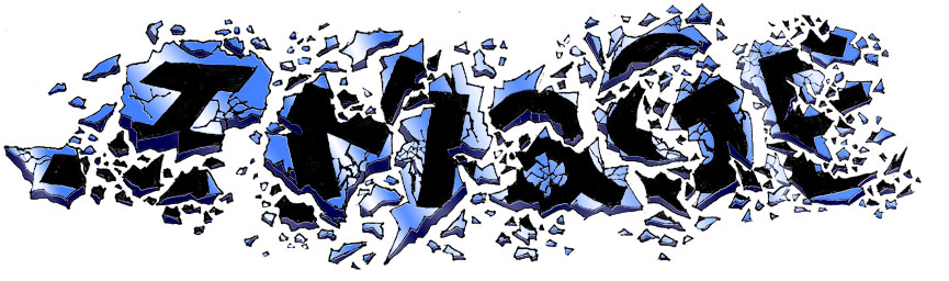
But in the end, they went with the one I was holding back from doing. Like the first one, when he said "image" I immediately thought to shatter it. But I didn't want to do that because it would be alot of work, even for a concept. And if they went with something else.. ugh.. hours wasted!
But after my mom told me to do it, because she was thinking the same thing, I decided I had to.
So the first one is my concept sketch. And they picked it! I was also worried about this one because if they PICKED it,it would be lots of work to do correctly.
But they did, so i got to work and did another almost final. It took me about 3 hours to ink it all in. And it was so dangerous, because if i messed up ONCE, the entire thing was trash. But luckily, I managed to make it without mistakes.
Cleaned it up, put it in photoshop, and colored it in. I was really quite amazed at how easily I was able to make it look fantastic with color. Two shades and a gradient.. It all just came together. best of all, I can make it any color I want, because it's all on layers.
And there you have it. These guys are rocking Texas right now, but I'm sure it won't be long until you hear them on the radio. And they have me working on another logo right now thats far more complex.. I'll post that, when and if I ever finish it.
All Images (no pun intended) are copywritten by Nathan Horsfall EXCEPT for the Broken one at the bottom.