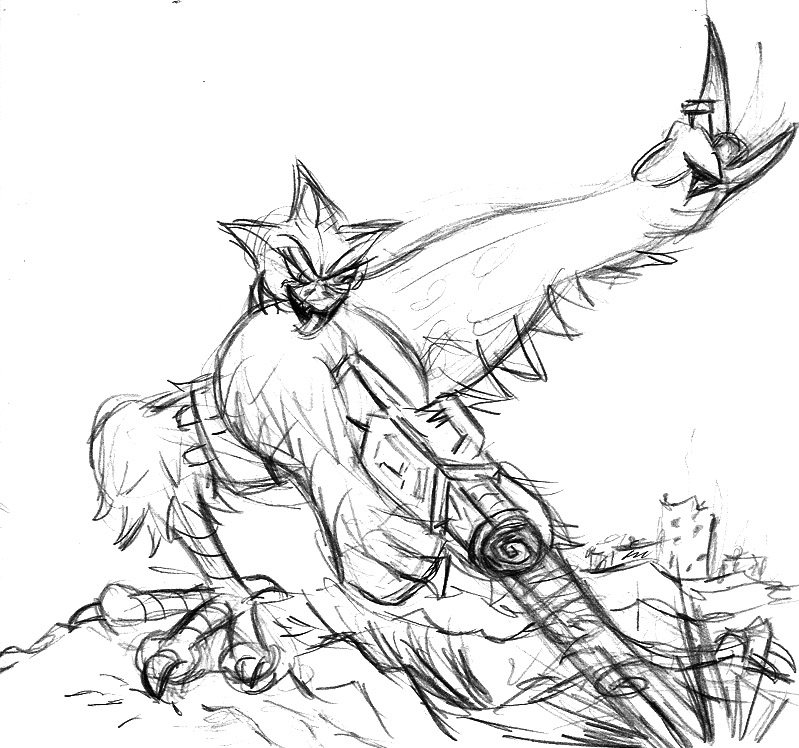
During GDC (Game Developer's Conference) one time, I entered into a drawing contest where you had to use the Nvidia logo in a theme. At the time I was watching them, the theme was "space" I think, but you could interpret it as loosely as you wanted to. So I was going to give Red a space gun which, she definitely loves.
I sketched this out before it was my turn to be called up, and guess what? they change the theme per group! >.< Probably to keep people from *cough* practicing.. But hey.
The Nvidia logo is the spot where the gun is firing. Just a sketch I whipped up in about 10 min.
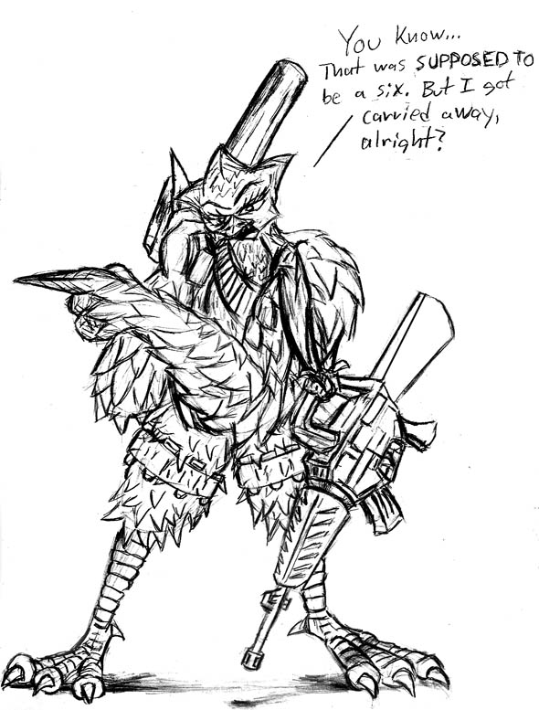
On the inside covers of my sketchbooks I usually draw something to show it's mine. This time around I made a shot up looking "6". Or at least, it was supposed to be. I got way carried away with it and you can barely see anything now, but to help redeem myself, I drew Red on the opposite page, pointing at it. And luckily THAT drawing turned out much better! One of my best with her, and everyone who sees it tells me she looks totally "badass". Thats what I like to hear! ^_^
One day I just felt like drawing in pen. While some of the drawings on this site might LOOK in pen to you, they're actually all pencil (blue pencil) which I adjust with Photoshop.
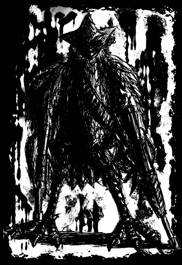
But these, were done in 100% pen. The tricky part about pen is that is that you don't get to erase, so it can be pretty damn dangerous. Rather than going for a clean look, though, I went extremely rough with them. It gives it that much more raw look. And coincidentally, it tends to make them look more dangerous too. So while most of the other drawings of Red are goofy and cartoonish, these carry a much more darker edge to them. Which is something I really like.
And this is just the above, with a bloody/shot up background to it.
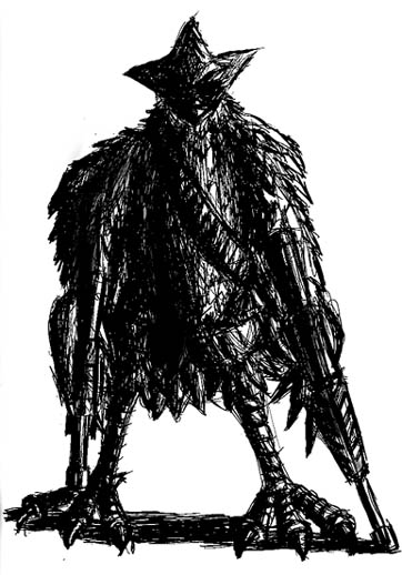
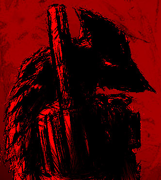
The first inking was alright, but I really thought I could go darker with it, so I made another one.
But it wasn't dark enough! So I took it into Photoshop and got the look I really wanted. A scary looking silhouette with only features were the light hits.
One of the people I played her with, really loved this, and told me it "captures the esscense of Red". And I have to agree with that. Beyond all the quirky goofy playfulness, she is a dark bird.
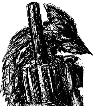
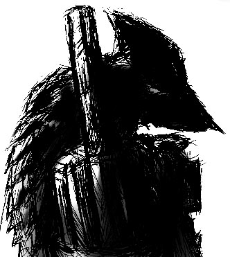
As I was putting this page together, I looked at the above picture and thought "I can make that even DARKER!" So I did.
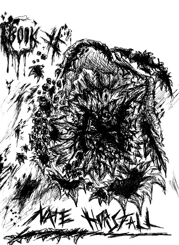
I love this one, it looks like a comic panel to me.
This isn't Red! But I don't have anywhere else to put her.
This is Dex, who is one of Red's former teammates, before she left them to go by herself. Dex is the reason Red left. In a careless explosion, Dex ends up caught in one of red's blasts, and nearly dies. Instead though, she's able to survive, due to cybernetic technology. But Red still hates herself for it, and leaves the group.
This was fun for me to do because it took alot of thought. More so than my usual stuff. Dex can't fly anymore, but since the birds on Red's world use their wings like hands, it still had to be rebuilt to function.
Maybe if i ever get more time I'll draw more of Dex! But don't hold your breath.
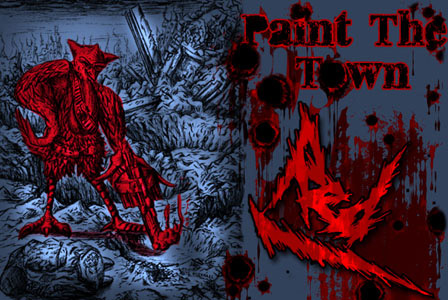
When I joined a UT clan for a little while, I made a custom signature for it. And thats it! I'll probably make a new one with the dark red drawing above, but for now, this is all.
It's navy blue because that was the exact color of the forum background, so everything looks like it's overlayed right ontop! No nasty image edge lines or anything.
On my comic site, I made a comic dealing with my work experience during the worst project I've currently been on. It's completely Red! While usually it's guild related, wtih my dragon and others, I took this break to use her because she got my feelings accross much better.
*Warning* Don't take it TOO seriously. Just think of all the coworkers you've ever been with, that made you want to kill them. I think we can all relate to that.
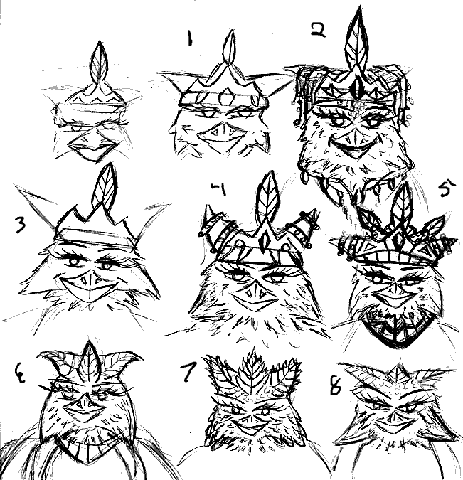
The next Sequence isn't actually Red.. but Red's mother. All of which will ultimately be for a single drawing later. But, it's a nice exercize to create the mother as a character.
This page consists of many different head types. I decided to focus on the head over everything else, since the body would be relatively basic.
Personal favorites here are 3 and 5. But 3 was too nice. Red's mother is more of the high and mighty Queen who is better than you are. Peasent.
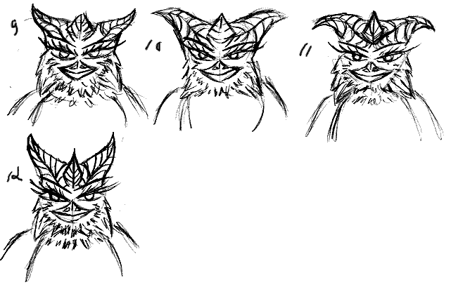
This page was more playing with what I could do with the "spikes" as I call them. They are actually supposed to be a sign of the royality in Red's race. However, Red has messed with hers and made it less so. The queen, then, should show what it SHOULD look like. Many different experiments here.
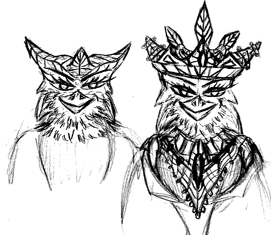
Taking a combination of mostly 5, 9 and 12.. we have this! And I'm quite happy with it on just about ever level. It certain captures that royal feeling I wanted, and shows off the "spikes" nicely. I did a second quick version of clothing, just to give myself an idea how it might look later. With the feathers like that, it adds to the overall royal crown.
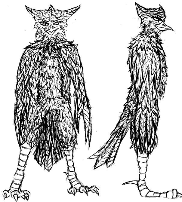
With the head done.. it's body time. Simgple model sheets, but what was most important here, is getting a feather pattern down. Red is very out of control with her feather layout. This, like the spikes, is supposed to show how it SHOULD be, if she took care of herself properly.
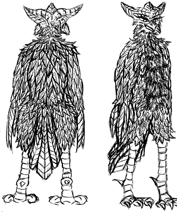
I was happy with the result, aside from the side head. bleh. something off about that.
Extremely happy with the back, and back patterns I got going on here. The 3/4thview appears cut.. but in fact, I ran out of paper! Whoops.